When creating a new SharePoint site, it is easy to get caught in the loop and use the same design your company has been using for ages. So, how do you make the new site a little bearable to use?
Here I have included some ideas that you should keep in mind when creating a SharePoint site from scratch. Mind you, this is not some masterclass on UI design. It’s just me sharing my experience on SharePoint sites over the years.
So, let’s get started.
SharePoint sites are like the help desk for the employees of your organization. Whenever they need some information, it should be right there.
But imagine if the same person dialed a call center to get the same info. They need to wait a long time to get the desired thing. And sometimes, the correct info is missing altogether. Imagine how the user should feel, then. The same thing can happen with a poorly designed SharePoint site.
As the one responsible for designing the central repository for information on your workplace, it is your job to make the users love the site, not hate it.
So, here goes some pointers to help you do that.
Implement Flat Design
This terminology is all the rage on SharePoint these days. But what does this mean?
Earlier, there were sites and subsites which were part of a single collection. Sites were interlinked to each other. The main problem here was when you needed to transfer the same site to a different place. Or maybe you needed to change permissions. This structure made it very difficult to do that.
With a flat structure, there is no subsite present. Users can access files easily with a better navigation system. All individual sites are part of a single collection now. You can link these together with a central site (a.k.a. Hub site), which I will cover below.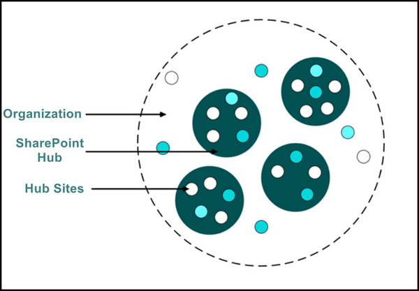
All these individual sites can then contain their own stuff. Let’s say a Marketing site will have the documents, announcements, and lists for that team only. So a person opening SharePoint will know exactly where to go if they need to access something specific.
Add Hub Sites
Once you have decided how many individual sites will be there, the next step will be adding them to a central Hub. Think of it as the homepage of your intranet. It will have links to different departments, which I mentioned earlier.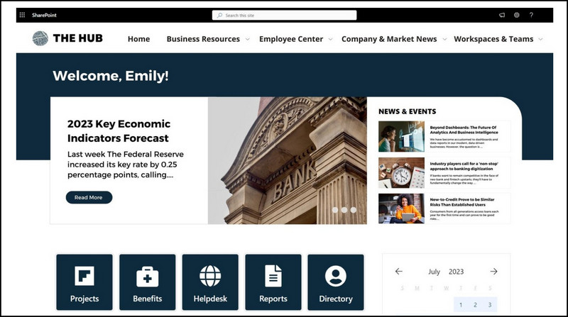
Even if you are on a different site on a hub, you can easily get back to other pages using a common navigation bar. This is a key feature of hub sites. This is what joins the individual sites together in one place.
Place Important Information at the Top
What’s the main thing that you look forward to when you start the day? Coffee and email, right? So, placing the appointments and announcements at the top of every page is a must. I always try to keep the calendar on the side pane. This is super useful as anyone could click there and see what they need to do for the day.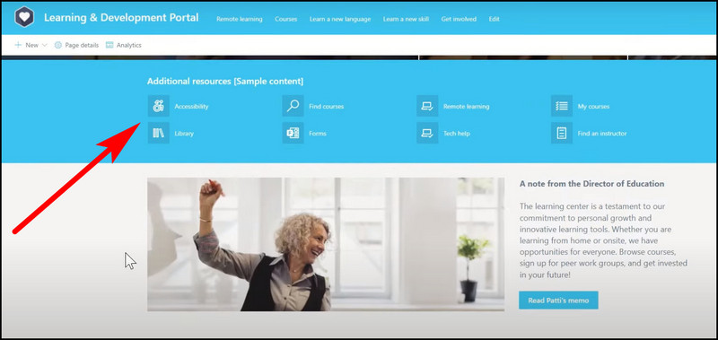
You could place a weather web part at the top if you wish. It gives off a clean look instead of keeping white spaces on your site.
Take a look at this site that I created earlier. Since the team needs access to documents quickly, there is no need to put this section in the middle of the page. So the user can get to the shared docs without scrolling all the way down.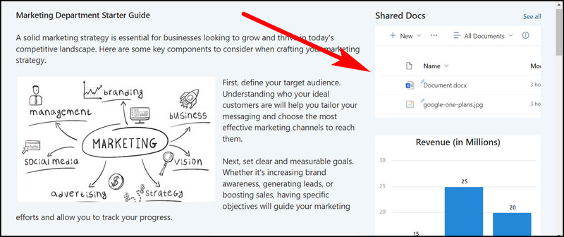
Declutter the Quick Link
A quick link is present on the left of your site and acts as a way to navigate around. You should look to keep only the things that you access frequently here.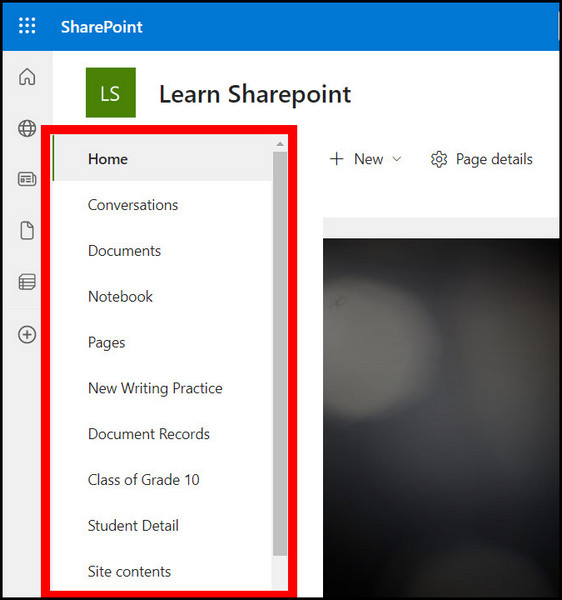
Quick link acts like a pathway to all the different places on your site. So naturally you will place document folders, lists, and all essential components inside a Teams site instead of a communication site.
Also, remember one thing. Your hub site should contain links to the separate team sites. Keep it short and impactful. Do not just populate it with links and make it look clunky.
Pro Tip: Remove the default shortcuts (Site Contents, Recycle Bin) that are created with every SharePoint page to keep the quick navigation bar clean.
For your company intranet site, you need the employees to be in touch with the latest stats. This includes revenue, profits, projected sales, etc. You can add these elements to the SharePoint page, which adds information without making the whole thing clunky.
Another tip to remember is every space is precious on your communication site. Do not just go and add data charts all over the parent site. Adding them to the sidebar is the perfect place to merge with other contents of a page.
If I were an employee of a company, I would feel this design gives too much information to the end user. What do you think about this?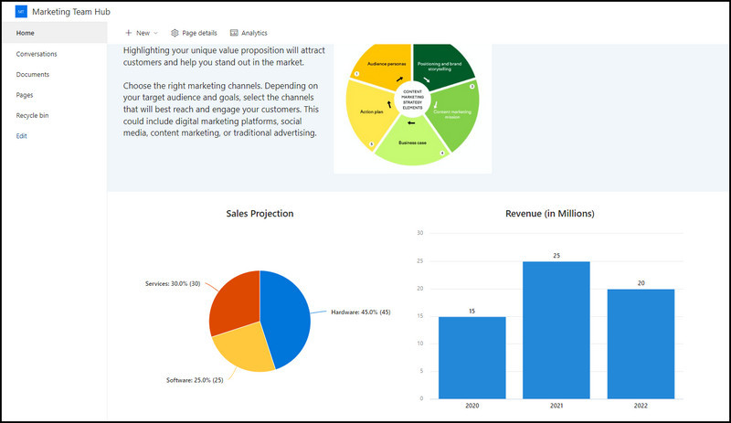
I have already talked about the importance of a central navigation bar. For a small organization, you may think about skipping this section entirely.
But without a nav bar, you will get lost. Sites will be difficult to find, and you will have to attend more calls complaining to IT regarding SharePoint.
Make the user’s path to a certain site as easy as possible. So design the navigation section accordingly.
Add Images to Make the Site Pop
Humans are more attracted to visual elements. Even if there is a simple link, a background image makes things look much better on any webpage.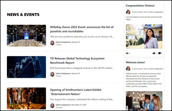
Your SharePoint site is no different. Images will add a visual pop to the overall feel and will make the site look good. But do not overdo this strategy. That, in turn, will make the site cumbersome and load painfully slowly.
Also, keep some white spaces between the sections of the SharePoint site. This makes the site’s contents easier to read. This is especially evident when a page has a lot of text.
Breaking the text with an empty section or an image keeps the user hooked to the content on a certain page. Just look at the image to understand the difference between the two.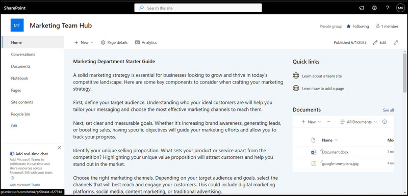
I have created one page with some plain text and another that has some images to it. Just note the difference it makes to the end user when they engage with the text.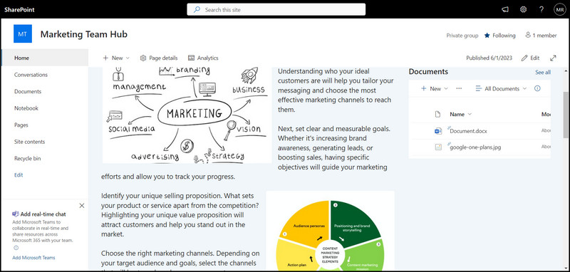
Keep Styles Consistent
Have you seen websites designed with a consistent theme in mind? The fonts, headings, and sections have a similar thing going on. That reduces distractions and makes users engage more with the webpage.
So try to keep the fonts consistent throughout the site. If your organization uses a certain font, try to add that to the SharePoint site. That way anyone accessing it will feel that they are in the right in your corporate environment
The same goes for colors. SharePoint provides you with a range of color palettes to use. That way, a heading will start with the deepest shade and lightens as you go down the page.
The site below demonstrates perfectly this.
Add Web Parts to Improve User Interaction
Another way of improving the user experience is by adding web parts to your page. Think of these as plugins to popular services that can be pinned. Right now, you can add Yammer, Twitter, and Viva Insights feeds.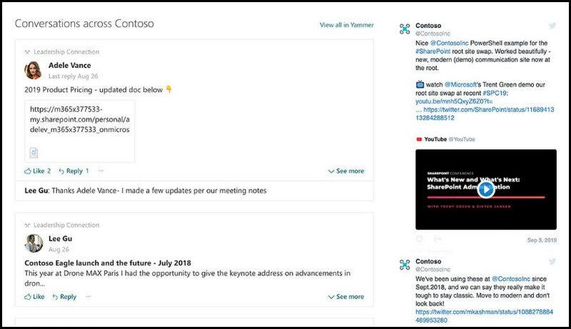
Try keeping the feed block short. Do not make it occupy a whole section of a page. And keep only the recent three posts. If a user really wants to view an old post, they can use those services separately.
Reduce Scrolling For Components
Any component you add, whether that is a document library or a feed from social media, must be limited to how many items they can show. Otherwise, the users will be left with an infinite scrolling section.
While adding such sections greatly impacts usability, try adopting a low-key state here. Treat this more like an accessory, not a necessity. If someone really needs to find old documents, the library will be of more use to them than the little documents widget on the home page.
If you are short of ideas about how the SharePoint site will look, go look at SharePoint Lookbook. Here the developers behind SharePoint have showcased designs for sites depending on their use cases.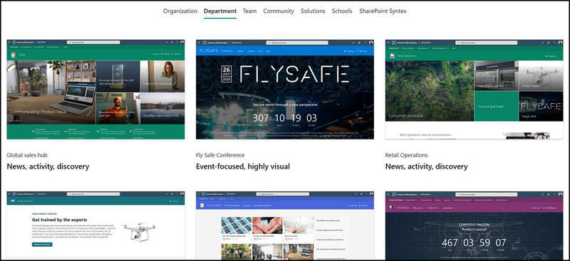
SharePoint being highly customizable, allows you to create a design based on those templates. You can easily add these to your account and make changes as per your need.
Templates are a quick way of preparing a SharePoint site’s structure. Once you have the core thing ready, you can take feedback from others on where you need to make significant changes.
Consult With Your Team
Every organization is unique to their own. A design that works for the Marketing team may not work for R&D. So before you start designing, take pointers from the members about the elements of the site. Then design a skeleton based on the feedback. Continue the conversations back and forth during the whole design process.
That way all parties will be satisfied with the final outcome and you do not need to make large changes.
Final Words
A well-made SharePoint site means your colleagues will find it easier to use it, and this improves the collaboration between everyone.
This article is not the only guide you need to design a great SharePoint site. Use resources from Microsoft where they talk about design elements and search for templates to find the right design that suits you.
That is enough tips for today.
See you next time on some other SharePoint tutorial.