MS Excel offers us many fantastic features; with those, we can create our desirable charts and tables.
If you want to present your data in an eye-cache manner, then making a scatter plot in Excel can help you. You can create a scatter chart and modify that chart to make it more transparent and understandable.
However, many articles on the internet about this topic are really complicated. But making a scatter plot in Excel is not so tough; it is straightforward. So from this article, you will learn how to make a scatter plot in Excel in two easy ways: Insert Scatter option and Chart Scatter option.
Don’t skip and read the full content to know about the scatter plot-making process and its use.
Let’s start!
When Do You Need to Use a Scatter Plot in MS Excel?
If you want to represent your specific data with a point inserted chart containing an X and Y axis, then you must use the scatter plot chart from MS Excel. This vertical and horizontal axis will show how one variable affects the other in a Microsoft Excel sheet.
When you move to the Excel Scatter Chart option, you will see different types of scatter plots. For your aid, I am displaying them beneath.
Here is the list of scatter plots available on MS Excel:
- Scatter
- Scatter with smooth lines and markers
- Scatter with smooth lines
- Scatter with straight lines and markers
- Scatter with straight lines
- Bubble
- 3-D Bubble
You can select one from this list and modify it according to your needs. Let’s head toward the main topic and learn how you can make a scatter plot in MS Excel.
Follow our guide on how to mail merge in Outlook with Excel & Word.
How to Make Scatter Plot in Excel
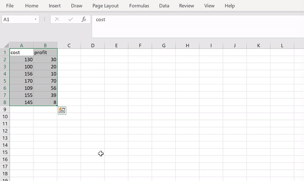
Creating a scatter plot in MS Excel is very easy. First, you need to select the variables from the Excel sheet. Then move to the Insert menu, select the Insert Scatter (X, Y) or Bubble Chart option, and choose your specific scatter format.
Also, you can use the Chart Scatter option; read along because I have described them easily in the following segment.
Here are the steps to make a scatter plot in MS Excel:
1. Use the Insert Scatter Option
If you want to scatter a chart in MS Excel, use the Insert Scatter option. It is the simplest and quickest method, and let’s find out how you can complete this operation.
Here are the steps to use the Insert Scatter option in Excel:
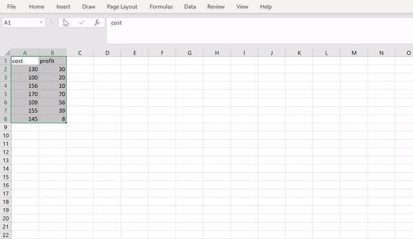
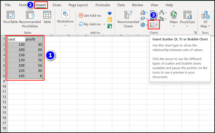
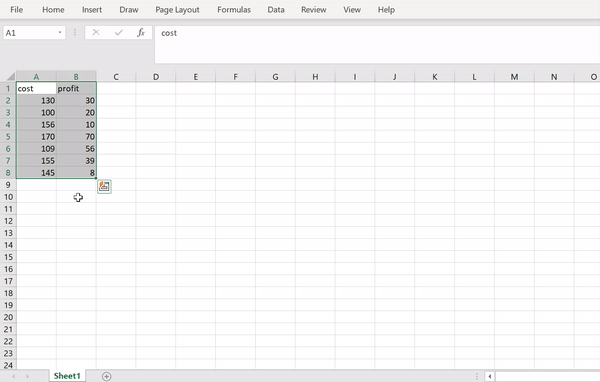
- Select data from the Excel sheet.
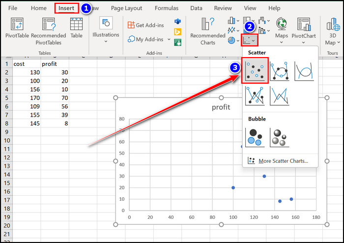
- Navigate to the Insert section.
- Click on the Insert Scatter (X, Y) or Bubble Chart option.
- Choose the Scatter option.
- Triple-click on the Chart Title and change it according to your need.
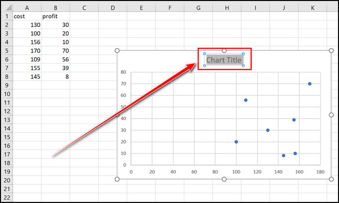
- Click on the Plus (+) option and choose Axis Titles to change the X or Y axis names.
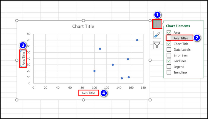
With the help of these simple steps, you can implement Scatter Chart into your Excel sheet.
Here’s a complete guide on how to lock and unlock Cells in Excel.
2. Apply the Chart Scatter Option
The Chart Scatter option can help you to compose a scatter plot in an Excel worksheet. Follow the stated instructions to make a scatter plot in an Excel sheet.
Here are the steps to apply the chart scatter option in Excel:
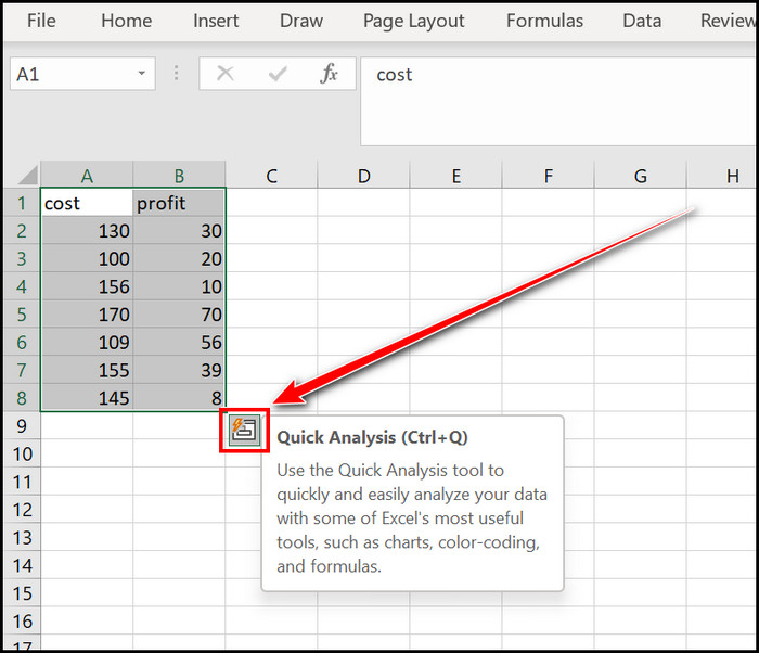
- Highlight the values from Excel.
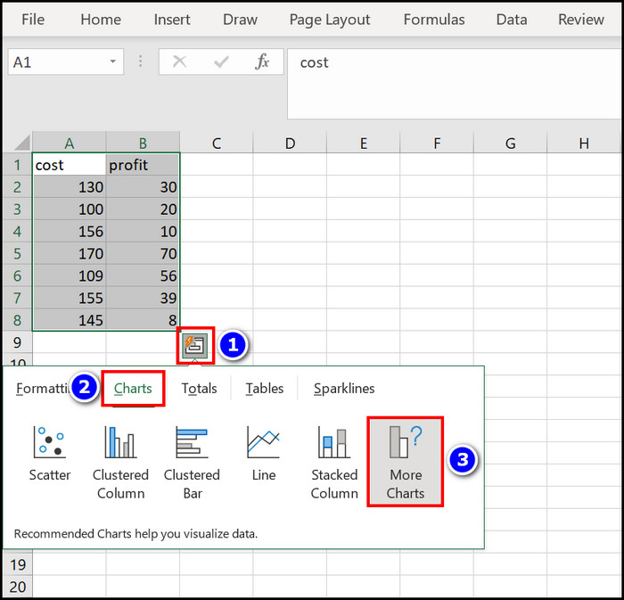
- Click on the Quick Analysis (Ctrl+Q) option.
- Select the Charts section
- Choose the More Charts menu.
- Move to the All Charts option.
- Navigate to the X Y (Scatter) section.
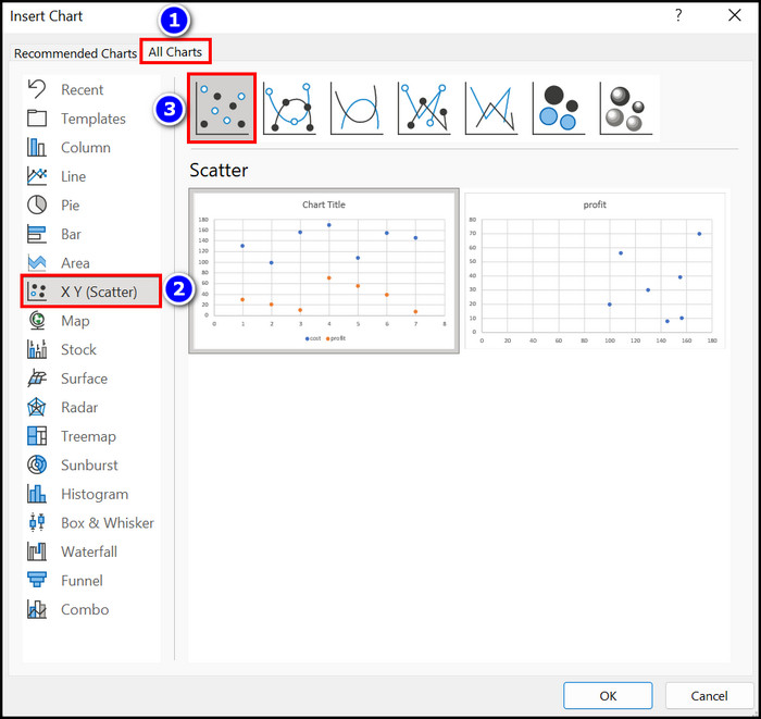
- Choose the Scatter option.
- Triple-click on the Chart Title and modify the name of the chart.
- Click on the Plus ( + ) icon and select the Axis Titles option if you want to alter the axis name.
A scatter chart is ready for you, and you can use this chart to represent your data nicely.
Check out our separate post to fix Microsoft Excel freezing or slow.
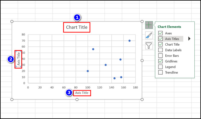
How to Add X and Y Axis Names in a Scatter Plot in Excel
When you first insert the Scatter Chart into the Excel sheet, it will not display the X or Y axis name. If you look at the axis, you will see just the axis value is demonstrated there.
Let’s sort out how to add X or Y axis names in an Excel scatter chart.
Here are the steps to add X or Y axis name in a scatter plot:
- Select data from the Microsoft Excel spreadsheet.
- Move to the Insert menu.
- Choose the Insert Scatter (X, Y) or Bubble Chart option.
- Select the Scatter option.
- Click on the Plus (+) icon.
- Enable the Axis Titles checkbox.
- Triple-click on the Vertical Y axis and change its name accordingly.
- Select the Horizontal Y axis with a Triple click and modify its name.
- Change the Chart Title name.
You will see that your specific X and Y axis name is now added to the scatter chart. If you want to know how to modify a scatter plot with labels and variables, follow the next segment.
Here’s a complete guide on how to copy values without formulas on Excel.
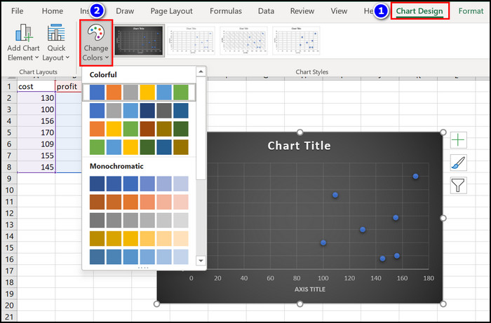
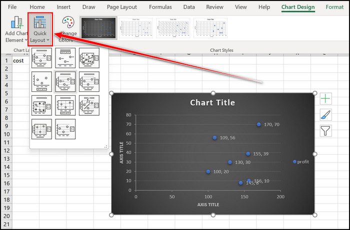
How to Modify a Scatter Plot with Two Variables and Labels
You can add charts to your MS Excel workbook to clarify your point. Adding a scatter plot in Excel can help you in this matter. Also, you can modify your Scatter Plot to make it more understandable and perfect.
Here are the steps to modify a scatter plot in MS Excel:
- Create a scatter plot with the Insert Scatter option.
- Add Chart Title and Axis Title into your scatter plot.
- Move to the Chart Design menu.
- Select a Style from the Chart Styles section.
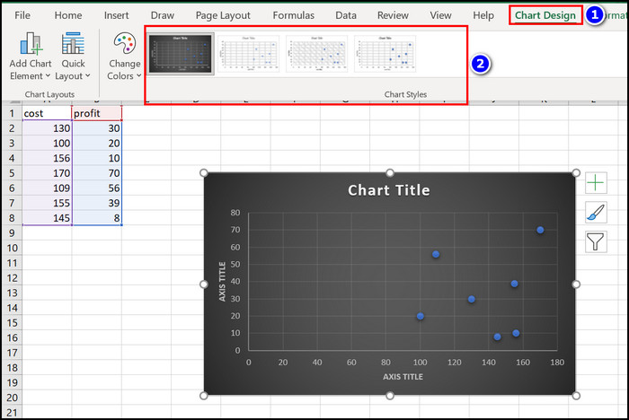
- Click on the Change Colors option to modify the chart color.
- Expand the Quick Layout option to change the overall layout.
- Select the Add Chart Element option, then choose the Data Labels tab to show the labels.
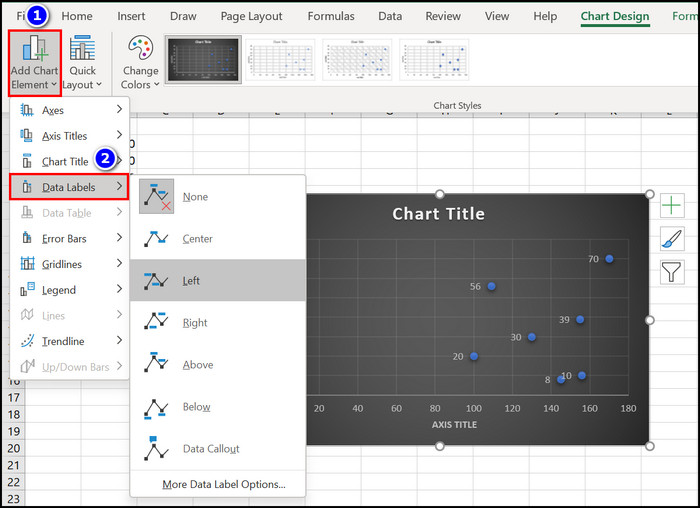
See the scatter plot, and save the Excel sheet when all your modification is complete.
Check out our separate post on how to install macro in Excel.
How to Add a Trendline to a Scatter Plot in MS Excel
For the visual representation of an Excel Datasheet, the scatter plot feature can come in handy. After making a scatter plot, if you want to add a Trendline, you must follow the instructions below.
Here are the steps to add a trendline to a scatter plot in Excel:
- Make a scatter plot with the Insert Scatter or Chart Scatter option.
- Insert Chart Title and Axis Title to the Scatter chart.
- Navigate to the Chart Design section.
- Click on the Add Chart Element option.
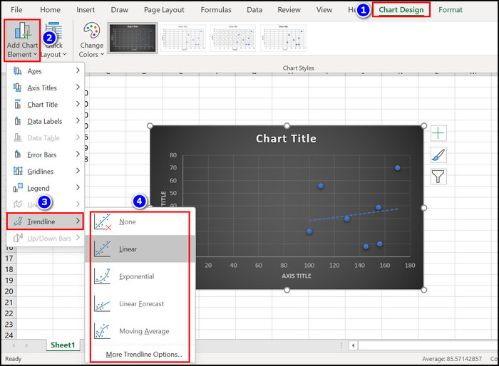
- Choose your desired Trendline such as Linear, Exponential or Linear Forecast options.
- Select the More Trendline Options if you want to build a trendline manually.
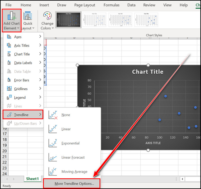
After completing the stated steps, you will see your desired trendline. Sometimes a trendline is crucial for business and analytics.
How to Make a 3-D Bubble Scatter Plot in MS Excel
A 3-D Bubble scatter plot can make our Excel sheet so unique that it will stand out among other data. To quickly create a 3-D Bubble scatter chart, follow the instructions carefully.
Here are the steps to create a 3-D Bubble Scatter Plot in Microsoft Excel:
- Select the values from MS Excel.
- Click on the Quick Analysis (Ctrl+Q) option from the bottom side of the selected data.
- Move to the Charts section.
- Click on the More Charts option.
- Select the All Charts box.
- Choose the X Y (Scatter) tab.
- Select the 3-D Bubble option.
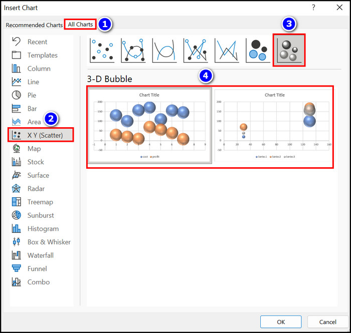
- Press the OK key to complete the process.
Immediately you will notice that your scatter plot is in the 3-D Bubble format. Add Chart Title and Axis Title to make your chart clear and readable.
FAQs
How do you make a scatter plot in MS Excel with two data sets?
To make a scatter plot in MS Excel with two data sets, you must select the data sets. Then follow the Insert > Insert Scatter (X, Y) or Bubble Chart > Scatter options.
How do you plot XY points in Excel?
If you want to plot an XY point in Excel, you need to highlight the datasets. After that, track down the following steps: Quick Analysis (Ctrl+Q) > Charts > More Charts > All Charts > X Y (Scatter) > Scatter options.
How do you make a scatter plot in Microsoft Excel with three variables?
Select the three variables and follow Insert > Insert Scatter (X, Y) or Bubble Chart > Scatter options to make a scatter plot in MS Excel with 3 variables.
Conclusion
A well-modified scatter plot can make the Excel sheet clear and interesting. Creating this scatter plot is also very simple.
You just need to follow the Insert Scatter or Chart Scatter option to complete this scatter chart-creating process. In this article, I also briefly described how to modify those plots with variables, labels, chart styles, layouts and color.
Overall if you read this content properly and follow its steps, you can easily make a scatter plot in MS Excel all by yourself.
How can I further assist you in this topic? Let me know in the comment below.